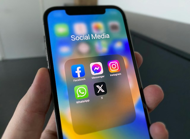
X, formerly called Twitter, has undergone massive changes since its launch in 2006. These changes have covered multiple aspects of the company over time. For instance, one of its most prominent features, the logo, has undergone several variations since the site first went live. The takeover in 2022 and eventual rebranding saw the company ditch the Twitter logo for a more emphatic X. But why did this happen?
Twitter’s first logo was a green “TWTTR” design that lasted a year before the company changed it in 2006. A few subsequent logo designs emerged between then and 2010 when the famous blue bird emerged. While the bird enjoyed several variations and re-illustrations during its time, it endured until the company changed hands. So, this post covers this topic, describing why the old logo gave way after the takeover.

What Was the Twitter Old Logo Before the Bird?
Twitter has undergone massive changes since its founders launched it in March 2006. While the blue bird seemed to have been around forever, it only became its logo. Of course, the app had previously used multiple logos before that design. The company’s recent rebranding has triggered a wave of questions about the social media platform’s history. People are now wondering what the Twitter old logo before the bird was.
Twitter’s blue theme has incorporated itself into the app, making it seem like its traditional color. However, this was not always the case. The company’s first logo was a glassy green illustration of the company’s initial name, “TWTTR.” Besides being glassy green, this logo had a slimy green color and a water-droplet effect. This logo did not endure for long as the company only used it before it officially launched to the public. So, the design lasted from 2005 to 2006 before the company ditched it.
The next logo for this social media company was in use between 2006 and 2010. This blue-themed illustration of the name “Twitter” was the first official logo for the social media site. This design consisted of rounded sans-serif characters that merged with the surrounding characters to form the word. These characters also contained a white outline, which formed a coat around the design.
In addition to this illustration, the social media company obtained a light blue image of a bird to go. While it did not include this element in the logo design, it appeared on the Twitter website as an icon. Overall, this logo became so famous since it accompanied the rise of the platform.
What Is the Story Behind the Twitter Bird Logo?

People often inquire about the circumstances surrounding the creation of the Twitter bird logo. As Twitter’s popularity and usage soured, the company updated its logo. Biz Stone, one of the company’s founders, created a new design from the existing logo and the obtained bird image. Stone adapted the bird image, creating a novel version suitable for the social media website.
This new design idea went through several designers who refined the bird before merging it with the old logo. In the process, the designers removed the white outline wrapping the old “Twitter” logo. The result was the name “Twitter” and the bird, dubbed “Larry the Bird.” While the app’s popularity skyrocketed, this logo became so recognizable that many people could easily identify it.
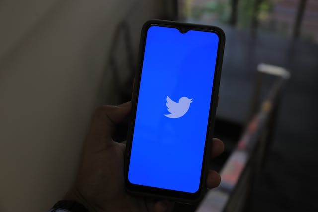
Two years later, the company decided to update the logo again. This time, it deleted the name “Twitter,” only keeping the bird. Of course, this bird image was as popular as the full logo, so the company had no worries. The company hired another designer who refined the bird, creating a more circular design.
This new design primarily consisted of the bird’s silhouette pointing skywards. The company also removed most of the details that characterized the initial design. This design went on to represent the app for over a decade before it finally gave way.
Why Did They Change the Twitter Logo After the 2022 Takeover?
The recent takeover of this social media company and the eventual rebrand from Twitter to X triggered waves of events. Elon Musk, the company’s new owner, has implemented many changes since the company changed hands. While he also played chief marketing officer roles, he didn’t act as CEO. The logo change is one of the most prominent variations that have characterized the social media company. But why did they change the Twitter logo?
The Twitter logo change to X was not a stand-alone implementation. Instead, it was only a part of the wider rebranding and overhaul of the social platform. The new ownership explained that it was turning the app into a powerful stand-alone social network capable of several tasks. This overhaul would involve making it the Everything app, also functioning as a financial services company.
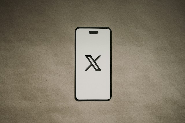
While this change drew mixed reactions from users, the company implemented it quite swiftly. The new logo is a simple stylized X, representing the company’s new name. This new logo did not come as a surprise due to the new owner’s affinity with the alphabet.
Elon Musk, who proposed this new logo design, had previously described his fascination with the alphabet. He had previously founded a company, X.com, which eventually became PayPal. While Musk has named one of his children X, his other company, SpaceX, also has the X affixed.
The logo change preceded a series of negative reactions from users. The more traditional group of users was of the stance to retain the blue bird. However, this change only symbolized the next important changes to come. While the company had already begun implementing its rebranding measures before the logo change, these measures peaked afterward.
What Is the Design of the Twitter X Logo?
During its tenure, the characteristic blue bird became synonymous with the social platform Twitter. Alongside its blue theme, this element was an icon in the social media industry.
However, the new Twitter X logo came with a new dark theme. After a quick poll he shared on his profile, Elon Musk created a dark-themed outlook to go with the logo. So, what is the design of this new logo?
The current logo of this company is a stylized white X symbol on a black background. While the X is white with one hollow cross, the dark background appears like shattered glass. Again, the company updated the new logo, adding thicker outlines to the X frame.
This new logo appeared to have targeted simplicity in line with the company’s new features. Instead of going for complex designs, the company picked an X for the role. Of course, its peculiarity has taken a huge leap since it strongly correlates with the app’s name.
What Was the Reaction to the Twitter New Logo?
The rebranding of the social media company drew a lot of mixed reactions from users. The Twitter new logo especially created much buzz from users who thought otherwise. In this case, many users argued that it was unnecessary to trash the highly popular bird logo. The bird logo’s symbology, as well as its overwhelming popularity among people around the world, was the major talking point. This argument pointed out that this move would set Twitter’s competitors ahead.
While many users argued against the implementation of a new logo, others were in support of its introduction. The major explanation in this case centered around the company’s plan to overhaul the original app completely. As most people insisted, Twitter 2.0 majorly targeted simplicity and encompassing functionality.
The new management greatly reinforced this argument, doubling down on the aim to make it the Everything app. Therefore, it insisted that the loo change meant that the app was no longer only for “tweeting.” The company has not implemented most of the promised features. However, several changes have occurred following the Twitter logo change, like the tweak to the verification feature.
Due to the platform’s continuous ease of usage, users sometimes share voluminous posts, posting potentially problematic content. Because of this, it is often important to delete posts in bulk. That is why TweetEraser has designed a simple and highly efficient web tool for removing posts in great numbers. This app loads posts from user archives, accessing even old posts. Since it does not spread promotional content, begin filtering and deleting your posts today!